GREATER BATON ROUGE ECONOMIC PARTNERSHIP REBRAND (2025)
In 2005, the Chamber of Greater Baton Rouge made a deliberate transition — becoming the Baton Rouge Area Chamber, or BRAC, to signal a shift toward regional economic development while maintaining its chamber membership and relationships. It was a practical solution for a pivotal moment. Twenty years later, the organization had evolved well beyond it.
The hybrid identity that once bridged two worlds had become a source of confusion, particularly for external audiences who couldn't reconcile "Chamber" with a full-service economic development organization. Site selectors and corporate decision-makers read "Chamber" and thought advocacy and networking — not business recruitment, cluster strategy, or regional competitiveness. The name was getting in the way of the work.
In 2024, one of my first priorities as incoming President and CEO was to address that directly. The organization needed a name, a brand, a voice, and a digital platform that could carry it into the next 20 years.
The Strategic Decision
Rebranding an organization is never just a creative exercise. It's a decision with real stakes — for staff, for investors, for the community that's been calling you BRAC for two decades.
The new name — the Greater Baton Rouge Economic Partnership — did something the acronym never could: it said exactly what the organization was and who it served. The Partnership. Nine parishes. One voice.
But a name change without a supporting brand system and a digital presence to match would be an incomplete transformation. From the start, the rebrand and the new website were conceived as a single, unified project — two expressions of the same strategic repositioning.
The BRAND

We selected Red Six Media as our agency partner to lead the visual identity and brand system. The creative insight that drove the work — economic development as a kaleidoscope — captured something true about the region: that its strength comes from the convergence of diverse assets, industries, and institutions. Small shifts in positioning, partnerships, and resources open new pathways to progress.
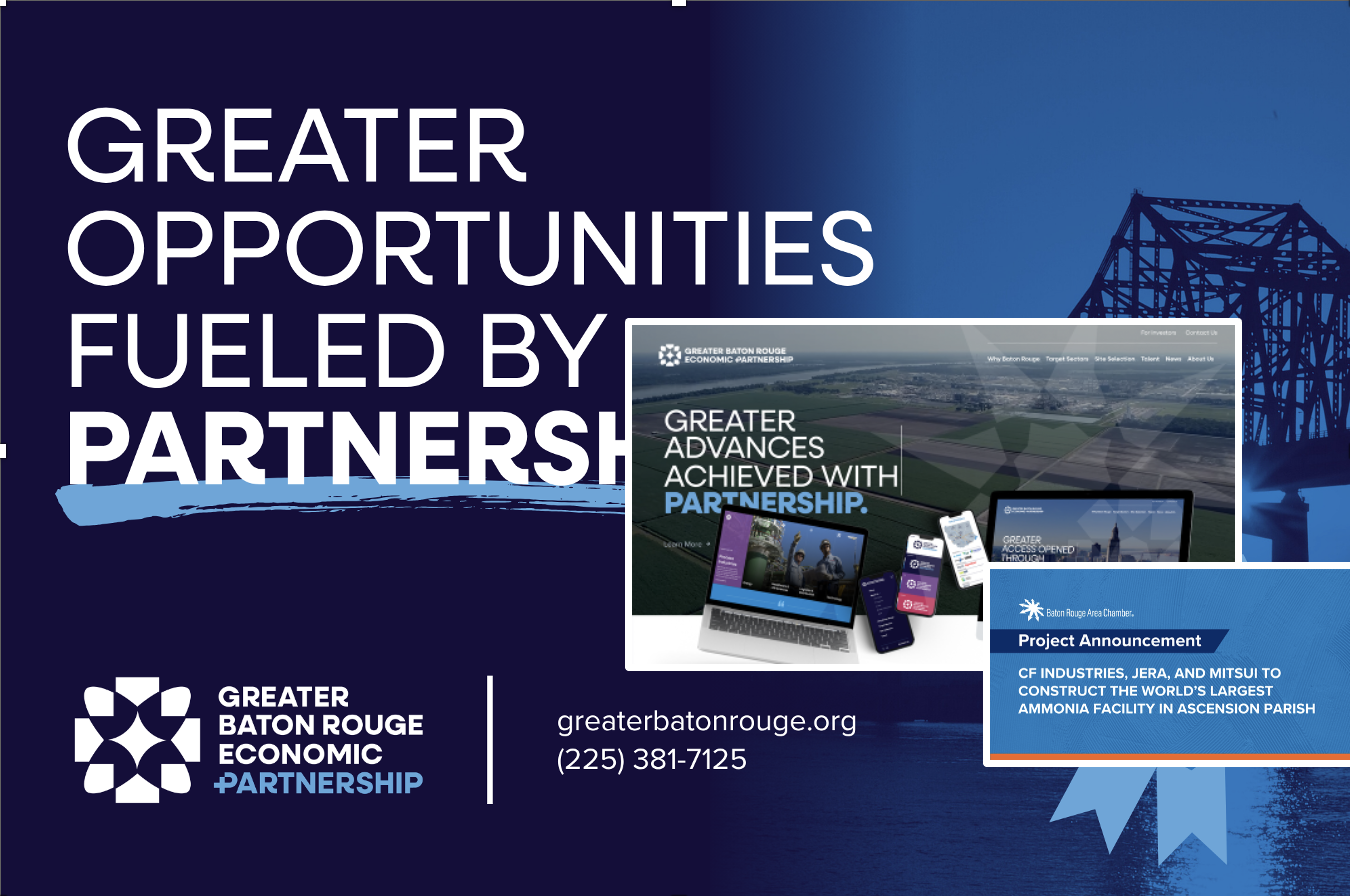
From that concept, Red Six developed a dynamic visual identity: a vibrant color palette, custom sector icons, and motion design that reflected the organization's action-oriented character. The result was a brand built for flexibility — one that could scale from a site selector presentation to a social media post without losing its coherence or energy.
The messaging system was equally important. Economic development organizations speak to a lot of different audiences simultaneously — site selectors, corporate leaders, elected officials, community stakeholders, investors. The brand architecture had to hold up across all of them while remaining consistent at its core.
The WEBSITE

The organization’s prior website was focused primarily on selling itself—its mission, its strategy, its accomplishments. The Greater Baton Rouge Economic Partnership’s website is focused on selling the region itself.
That's a simple distinction that changes almost every decision — the navigation, the photography, the content hierarchy, the user journey. When the organization is the product, you lead with staff bios and mission statements. When the region is the product, you lead with why a decision maker should care about Greater Baton Rouge before they ever learn what the Partnership does.
The navigation reflects that directly: Why Baton Rouge. Target Sectors. Site Selection. Talent. The organization lives at the bottom of the menu — where it belongs.
The visual identity carries the kaleidoscope concept throughout, grounded by authentic photography of the region and its people. No stock images. A site selector who visits this platform should feel like they're actually seeing Greater Baton Rouge — not a generic rendering of what a southern city is supposed to look like.
For decision-makers specifically, the site does the things that actually move deals: sector-specific landing pages with real data and direct points of contact, an integrated sites and buildings database, success stories with real company names and real investment figures, and testimonials from companies that have already chosen the region.
THE RESULTS
The response upon launch was immediate. Local stakeholders connected with the new name, identity, and digital experience in a way that felt both aspirational and grounded. Internally, the team embraced it with genuine enthusiasm — which matters more than it might seem. A rebrand only works if the people delivering it believe in it.
Most importantly, the transformation gave the organization something it hadn't had before: clarity. A defined purpose, a cohesive visual presence, a digital platform built to drive action, and the confidence to compete at a higher level.
Awards:
XX
XX
My role in this project was creative and content advisor and to manage the effort under the leadership of the Marketing and Communications Team.
Agency Partners: RedSix Media
Internal Team Members: Morgan Almeida, Katie Harris